louis vuitton

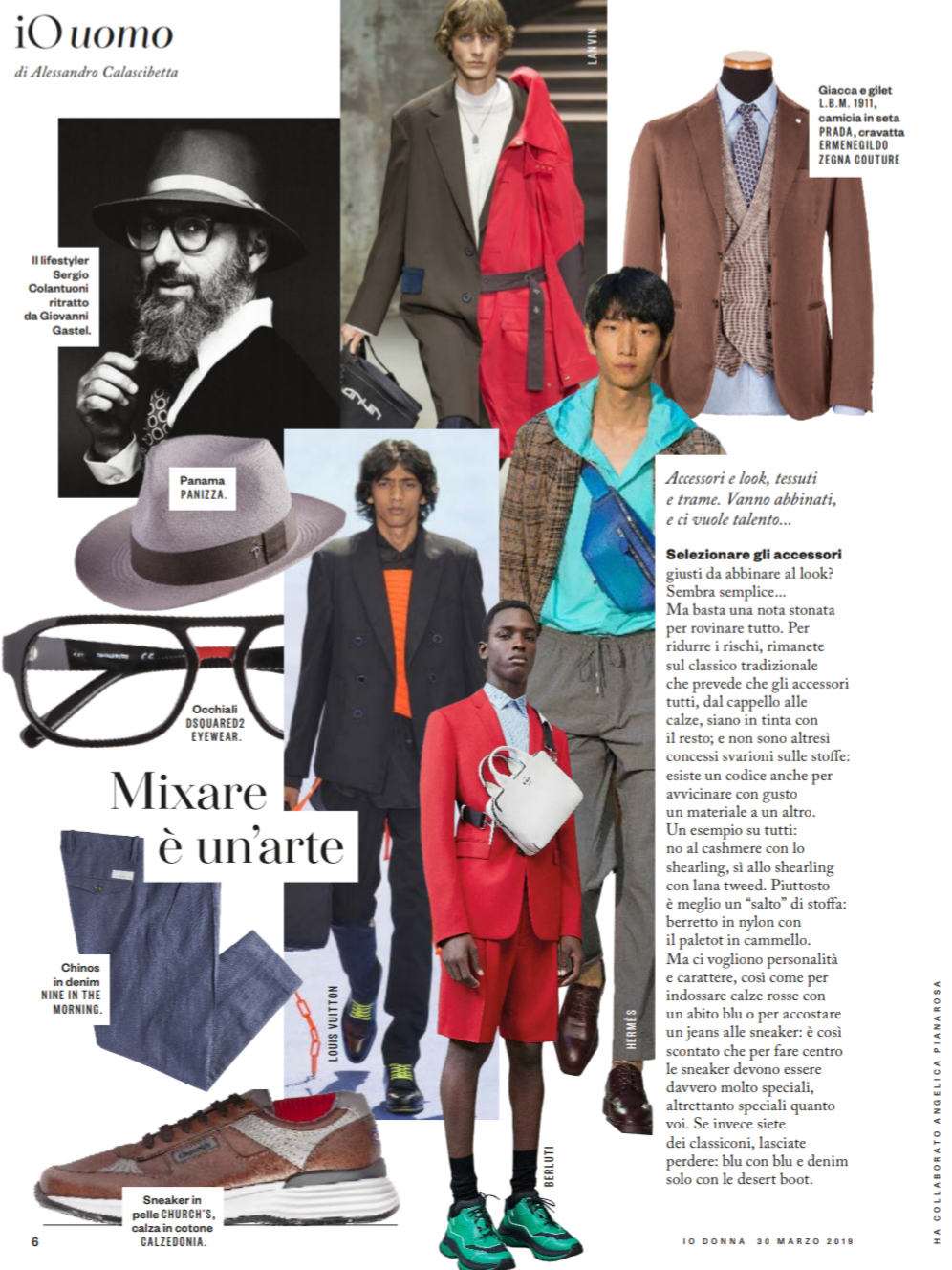
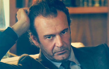
IO UOMO – ONORE AGLI STYLIST

21-io-uomo-txt_11525241

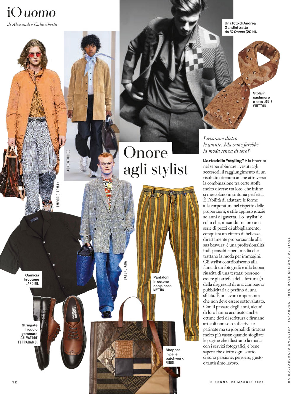
Ode to the stylists. Styling is a job that can be learned by experience, in years of practice, on fashion shootings’ sets. The stylist knows how and when to mix fabrics, prints and colors. He/she knows how to adapt clothing fits to body shapes, according to the proportions. The stylist is the professional that, mixing and matching clothes, creates a final result that pleases, amazes, reassures: in other words it plays a fundamental role for fashion media. Stylists can help photographers building their careers, they can contribute to the success of magazines, editorial campaigns and fashion shows (or they can ruin them as well). It’s an important role that shouldn’t be underestimated. Some of them gained great writing skills through the years and they now write remarkable articles not just for slick magazines but also for widely-read newspapers. When flipping through fashion editorial pages one should consider that behind each single shot there are passion, thoughts, good taste and quite a lot of work.

IO UOMO – MIXARE È UN’ARTE

IMG_20190330_162607

The art of matching. Selecting the proper accessories that matches your look seems easy, but even a little detail can ruin everything. To reduce the risks, respect the rule that want every accessory, from hat to socks, to be in pendant with the outfit; and no mistakes allowed even concerning the fabrics: there are also rules about matching different materials in the proper way. For example: don’t match cashmere with shearling, yes to shearling with tweed. Rather is better to opt for a complete change of fabric: nylon hat with camelhair coat. But personality is required, as well as for wearing red socks with a blue suit or sneakers with jeans: this is so obvious that the sneakers have to be really, really special. But if you have classic tastes, stay classic: blue with blue and denim only with desert boots.

IO DONNA SCHEMA LIBERO – M COME MODA

17-MODA-R-schema-libero_Storia7(1)

M like Mode. The first issue of M was published twelve years ago, in spring 2006. M was one among many glossy fashion magazines: nice size (big), high-quality paper, great photographers and important brands for pages that showed the season’s trends; it was the last fashion specialized published by Rizzoli. The type and font of the letter M was the same of a very popular RCS magazine: Max, the monthly publication well-known for calendars (Ferilli issue was reprinted and sold more than 500thousands copies). But Max was many other things: De Niro on the cover of the first issue (1985) and the first italian magazine to have Lady Gaga on the cover (december 2009, picture by Ellen Von Unwerth) back when no one would have imagined, thanks to the intuition of Andrea Rossi: the same journalist that today writes “Il graffio” for Style Magazine. M like Mode, M like Max. Many readers conserve M issues still today, that hung in there since the beginning of the great crisis, three years later. And it’s interesting to notice that today many young people, between 25 and 35 years old, show a real interest for paper magazines that are high-impact, glossy, very well-finished. But the best thing is to be a success both in paper and online publications: an example? The supplement you are reading, Io Donna…

STYLE TIPS #3: BAGAGLI – COME SCEGLIERLI

Il terzo appuntamento di Style Tips si allinea con il periodo: festività su festività, voglia d’estate e gite fuori porta, vacanze imminenti (più o meno). E la categoria che decidiamo di affrontare è quella, spesso sottovalutata a livello stilistico, delle valigie.

Ovviamente non possiamo pensare … Continua a leggere →

IO DONNA SCHEMA LIBERO EFFETTI SPECIALI

44-MODA-R-schema-libero_Storia8Special effects. “Susy Benner decided to improve her ballet level in the most famous dance school in Europe, the Friburg Academy. She arrived in Germany from New York at 22:45…”. This is how the nightmare of Susy/Jessica Harper starts. Suspiria (1977), 2nd only to Deep Red (1977), is one of Dario Argento’s best movies and represents his passage from thrillers to horrors. Creepy soundtrack and special effects (with the limits of that years) that set new standards. The photography by Luciano Tovoli is a very strong connotative element: bright colours, invasions of shades of red and blue. The academy’s wallpapers with surreal patterns were inspired by the drawings of Maurits Cornelis Escher. A pop and at the same time claustrophobic opera. A must-see.